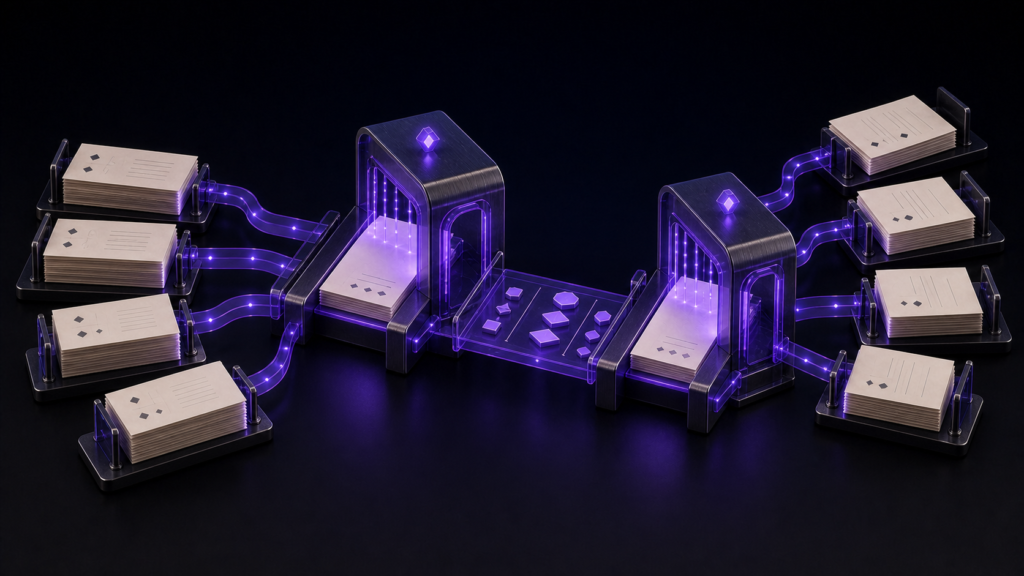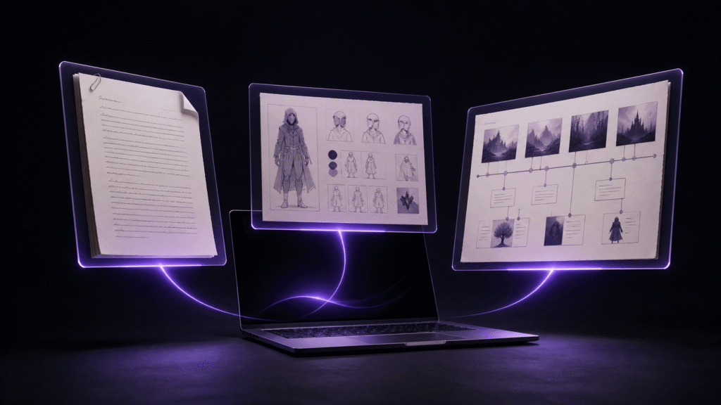
Working on a 13-inch MacBook does not mean squeezing a manuscript, character sheet, and timeline into three narrow columns all day. A better approach is to switch between one-, two-, and three-pane layouts according to the decision you are making. The purpose of multiple panes is not to display the largest possible amount of information. It is to keep the sentence you are writing and the one reference needed for that sentence within the same field of view.
Draft in one pane
Use a single wide manuscript pane when you are writing dialogue, action, or description continuously. Keep the character sheet and timeline open as tabs, but do not force them to remain visible. On a small screen, permanent side panes make lines wrap early and can turn the shape of the editor into a distraction.
When a factual question appears, bring the relevant reference into a second pane. Check it, make the decision, and return to the single-pane writing layout. This distinction matters: keeping a file open is not the same as keeping it visible at all times.
Before returning to the manuscript, confirm whether you edited the reference or merely consulted it. If you changed a character fact, save that change in the character sheet first, then search the manuscript for passages affected by it.
Use two columns for character continuity
Place the manuscript on the left and the character sheet on the right. Giving roughly two-thirds of the width to the manuscript usually leaves enough room for names, ages, forms of address, and speech notes in the reference pane.
Imagine a scene in which the protagonist addresses her aunt as “Professor,” although an earlier chapter uses “Aunt Mira.” The right pane lets you decide which form is canonical while the sentence remains visible on the left. If the character sheet is wrong, correct the sheet rather than silently treating the current line as a one-off exception. Then search the manuscript for other occurrences of the old form.
This arrangement is different from a general three-file dashboard. Its purpose is a specific editorial question: does the voice and identity in this sentence match the character record?
Open three columns only for timeline problems
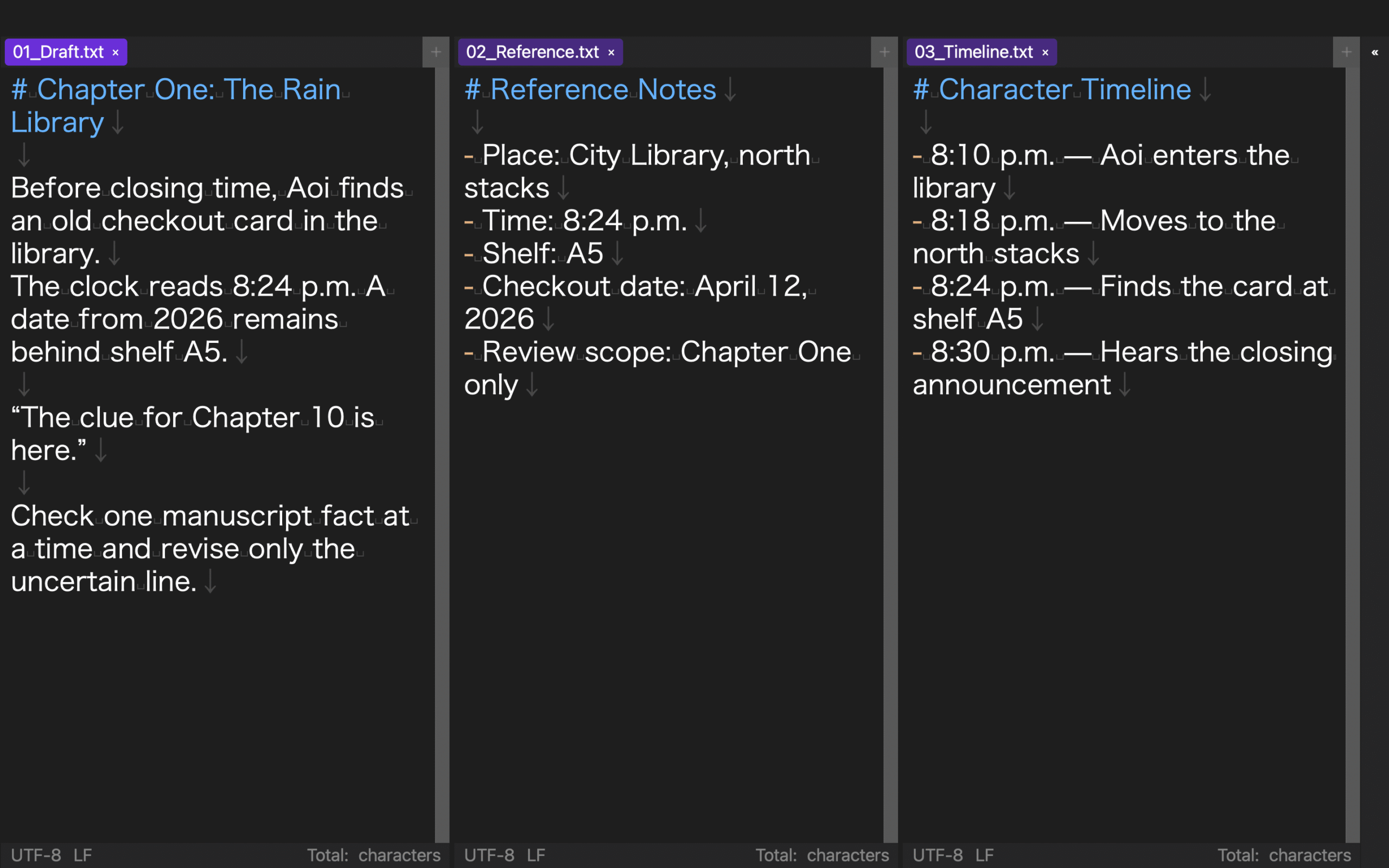
A three-column layout is useful when a scene depends on both character state and chronology. Put the manuscript on the left, a compact character sheet in the middle, and the timeline on the right. The timeline should expose dates, locations, participants, and elapsed time without requiring another search.
If the text becomes too narrow to read, remove the middle pane and compare only the manuscript and timeline. Three visible files are not automatically better than two. Use the smallest layout that contains all evidence needed for the current decision.
For example, if Chapter 12 says a wound healed in two days but the timeline allows only one night, the timeline is the relevant reference. The character sheet can wait as a tab. Once the date is resolved, return to the writing layout instead of leaving the screen in diagnostic mode.
Give every position a stable meaning
Even when the number of panes changes, keep the roles predictable: manuscript on the left, people in the middle, time on the right. Repeatedly swapping those roles makes the eyes search for a file before every comparison.
If a tab is moved to the wrong pane, recover by file name and restore its role. If a saved layout reopens with an unexpected chapter, do not assume the cursor and tab state were restored exactly. Check the chapter heading and nearby sentence before editing.
Copies introduce another risk. When the visible character sheet is not the canonical file, decide whether to transfer the change or make the copy canonical. Do not assume edits have been merged merely because two files appeared in the same workspace.
Recover when the screen becomes crowded
Search panels, sidebars, and three narrow panes can leave too little width for prose. Close panels that are not part of the current decision or return to a single pane. Reducing the font until every file technically fits is a poor recovery strategy because it increases reading errors.
Name saved layouts after jobs rather than files: Writing, Character Check, Timeline Check, and Full Comparison. A job name answers the practical question “Which view do I need now?” more clearly than a list of filenames.
After switching layouts, verify that the left pane contains the intended manuscript chapter. A layout is a starting configuration, not proof that every tab, cursor, and unsaved state is exactly where you left it.
Where Rune Studio fits
Current public documentation for the Mac version of Rune Studio describes one-to-three column and one-to-three row splits, moving tabs between panes, marker-based linked scrolling, and storage for up to four layouts. Those documented capabilities make it a candidate for the manuscript-and-reference workflow described here.
This is a claim based on published feature information and the current interface, not a report that the 13-inch test case in this article was completed successfully. It also does not cover external-display comparisons, collaborative editing, or cloud synchronization. Test the layout with your own MacBook size, files, and current app version.
Start with one useful comparison
Duplicate a manuscript chapter and character sheet. Put the chapter on the left and the sheet on the right. Resolve one form-of-address question, save the reference if it changed, and return to a single-pane drafting view. Add the timeline as a third pane only when a chronological conflict truly requires it. A focused two-pane comparison is more valuable than an impressive screen full of unreadable files.