To decide whether a text editor font is readable for a long Japanese manuscript, do not begin by ranking font families. First decide whether one proposed display setting passes three acceptance gates: similar glyphs remain distinguishable at normal zoom, selected sentences have traceable wrap points, and the same display can be restored later.
This guide adds review positions to one 2,000-character Japanese sample and marks one font-size-spacing combination as accepted or revise. It does not run a timed multi-font proofreading comparison. Reading time, planted-error totals, and candidate ranking are outside this decision, as are commercial rankings, health claims, and identical wrapping on every Mac.
Turn readability into three acceptance gates
Define the gates before changing a setting. The glyph gate checks internal kanji strokes, dakuten and handakuten, Japanese punctuation, and quotation marks at the zoom you normally use. The wrap gate records where four selected sentences first continue on the next line and whether their end and start anchors remain traceable. The restoration gate records the font family, weight, text size, line spacing, and content width, then confirms that you can return to the same display.
Do not merge the gates into one impression such as “comfortable.” A setting can show every glyph clearly yet make location anchors unstable. It can also look excellent once but be unsuitable for a shared proofreading process when nobody can reproduce it the next day.
Mark eight review positions in one 2,000-character sample
Duplicate 2,000 characters from the manuscript without rewriting the prose. Record eight locations as G1 through G8. Include two close kanji shapes, a katakana-versus-kanji shape pair, dakuten and handakuten, Japanese comma and period, opening and closing quotation marks, a two-digit number, an ellipsis, and a dash. The location note can use a chapter ID and opening words so that the manuscript itself stays unchanged.
Choose four sentences of different lengths as W1 through W4. For each sentence, record the word immediately before its first wrap and the first word on the next line. This method does not count reading errors or time a proofreading session. It asks whether the planned display exposes the eight targets and makes four wrap anchors identifiable.
If you correct the sample prose, increment its version, such as sample-v2. Do not combine an old display result with a revised passage. Otherwise, a prose improvement can be mistaken for a font-setting improvement.
Accept or revise one display setting
Record the setting you actually intend to use. A sample card might say “Candidate A Regular, 18 pt, medium line spacing, 720 px content width, 100 percent zoom.” Check G1 through G8 without zooming or copying characters into search. Then record the wrap boundary for W1 through W4 on that same screen.
The acceptance card needs only three rows:
- Glyphs: can G1 through G8 be distinguished at normal zoom?
- Wrapping: can the line-end and next-line anchors for W1 through W4 be recorded?
- Restoration: after switching away, can the same values and wrap points be restored?
When all three pass, the combination is usable for this manuscript and display. It does not need to beat another font. If a row fails, keep the failed target and move to a single adjustment.
Change only the value connected to the failed gate
If a dakuten target is unclear, change either weight or size first, not both. If one selected sentence leaves punctuation alone on the next line, change either content width or size. Do not change font, size, spacing, and width together; that erases the reason the failed gate improved.
Retest the failed row first. After it passes, read all G and W positions again to make sure the adjustment did not damage another target. This is not a fast ranking method for many font families. Its value is a clear relationship between one display value and one acceptance result.
When two values could explain a failure, test the one that preserves the accepted locations. If only G3 fails while W1–W4 pass, try weight before changing content width and destroying the wrap record. If all eight glyph positions pass and only W2 is hard to trace, keep the font and adjust width. This chooses the next move by whether one failure was repaired without losing passed gates, not by an aggregate candidate ranking.
Check which display conditions Rune Studio can preserve
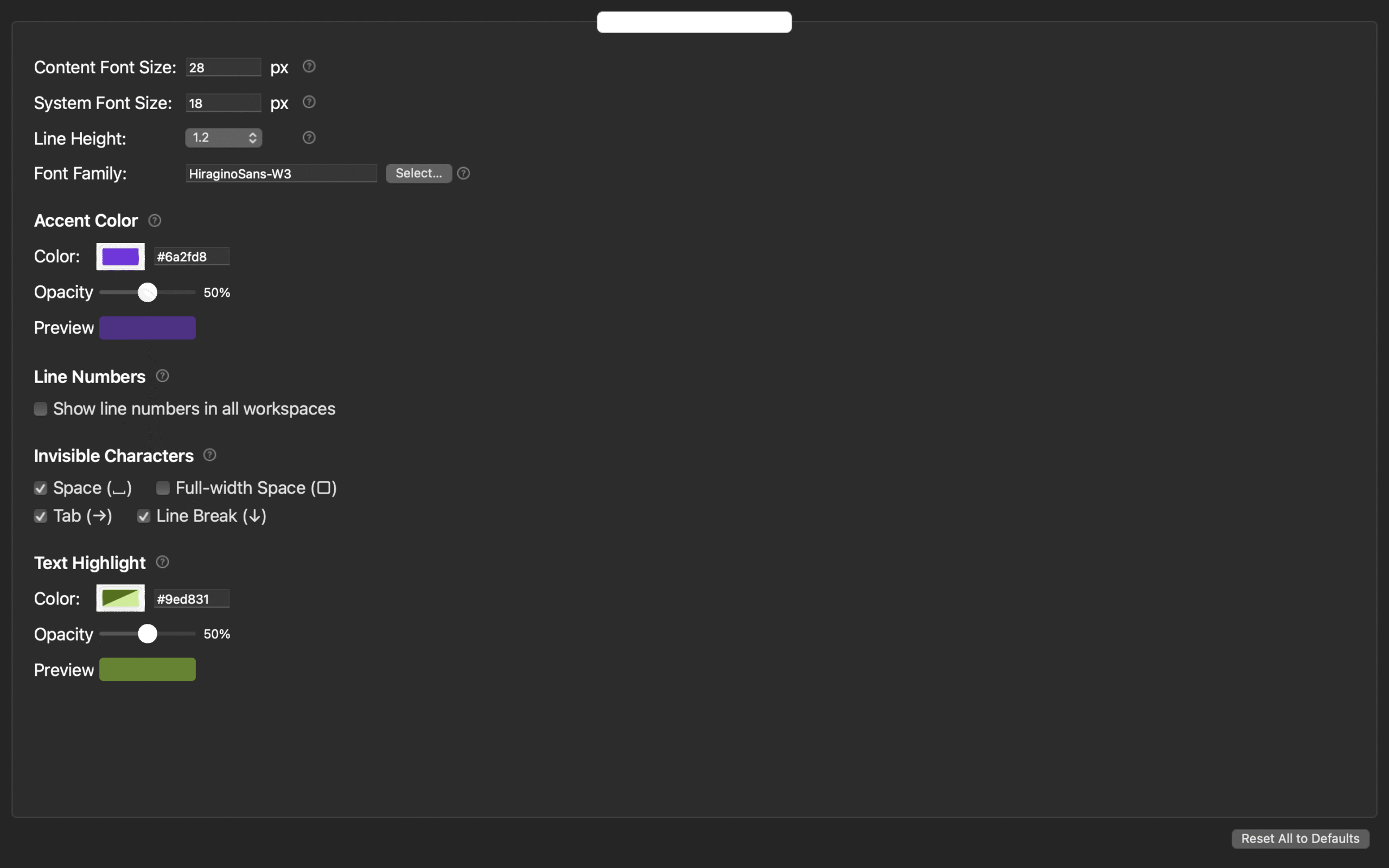
Current Rune Studio documentation for Mac describes body-font, body-text-size, and line-spacing settings and editor reflection. Workspace layouts can store content-size and line-spacing overrides. Those controls can reduce the work of returning to an accepted combination.
In a hands-on check, layout text-size values survived reopening, a fifth layout was accepted, and all five remained after the workspace was reopened. This does not establish a five-layout maximum. The actual upper limit is unconfirmed, so a comparison note should record the layout name and stored values instead of relying on a stated count limit.
The hands-on result covers layout storage and reopening, not a completed G1–G8 and W1–W4 run or the time required for a settings change to appear. Font availability, OS differences, physical display size, and the result on your manuscript remain separate conditions. Use a copy of important text and perform the three checks in the actual environment.
Leave font ranking and task presets to their own workflows
Use a timed comparison when the decision is to rotate several fonts through equal proofreading periods and rank them by rereads, misreads, and detected errors. This article does not measure time or discovery totals. It screens one combination against three acceptance gates.
Use task-specific display presets when one selected font needs separate drafting and proofreading settings with different spacing, bottom padding, or auxiliary marks. This article records one Japanese long-form display and its glyph, wrap, and restoration results, not two task profiles.
Make the comparison note reproducible by another reviewer
Record the sample ID, font family and weight, body-text size, line spacing, content width, zoom, and macOS version. Then keep the G1–G8 results, the line-end and next-line anchors for W1–W4, and whether restoration returned to the same view. “Readable” or “tiring” alone does not let anyone repeat the three gates.
Treat an external display as a separate environment rather than appending its result to the original screen. Width and zoom can change wrapping even when the font name stays the same. When handing the result to another reviewer, include the G and W location map rather than only your verdict. The other person can then reproduce the conditions without turning preferences into an average score.
Conclusion: accept one combination against three gates
Duplicate 2,000 characters from a real manuscript, identify eight glyph locations and four wrap sentences, and record one font, size, spacing, and content width. Judge glyph distinction, traceable wrapping, and restoration separately. When one row fails, change only a connected value.
The finish line is not a score above another candidate. It is a statement that G1–G8 remain distinguishable at normal zoom, W1–W4 have recorded wrap anchors, and the same display can be restored. Review the current Mac setting scope on the Rune Studio product page and run the same three gates on your copy.