This article begins after you have selected a font. It does not rank typefaces again. The practical task is to turn one chosen font into two reproducible display profiles: a quiet drafting view and a proofreading view that restores the cues needed to find errors. Record the values and switching triggers on one card, test both on the same English passage, and confirm that you can return to the drafting profile after review. Health and eyesight claims remain outside the test.
Give the selected font two different jobs
Drafting and proofreading do not ask the screen to do the same job. During drafting, you need to return to the active sentence after pausing to think. During proofreading, you need to distinguish similar letter shapes, straight and curly quotation marks, punctuation spacing, and small differences in names. Keep the font fixed and create a quiet drafting profile plus a more informative proofreading profile.
Record observable friction instead of relying only on first impressions. During drafting, count how often you lose the active line or insertion point. During proofreading, count planted errors found and correct text changed by mistake. The question is whether each profile performs its assigned job and can be restored, not whether another font would win.
Build one 500-word English test passage
Take about 500 words from the kind of English fiction you write. Include dialogue, dense narrative prose, smart quotation marks, em dashes, ellipses, digits, and several proper names. Add shapes you personally confuse, such as rn and m, cl and d, or 1, lowercase l, and uppercase I. Keep the selected font, passage, window width, and viewing distance fixed.
Make a duplicate containing five known defects: a one-letter error in a name, straight quotes among curly quotes, a doubled word, an omitted apostrophe, and inconsistent em-dash spacing. Keep the answer sheet in another file. The proofreading profile now has an English editorial task instead of a Japanese width or glyph convention.
Change size and line height one at a time
Save your current values before changing anything. Increase only font size for the first run. Restore it, then adjust only line height for the second run. When both variables move together, a better result cannot be attributed to either change. Combine them only after each has passed its own test.
More line spacing is not automatically better. Excess spacing can break the visual unity of a paragraph and remove too much context from the screen. Tight spacing can make the eye jump into an adjacent line. The useful value is the narrowest range that prevents line confusion while keeping the paragraph you need in view.
Use bottom padding and auxiliary marks deliberately
When the last line is pinned to the bottom edge, the active sentence has little empty space around it. Bottom padding lets the insertion point sit higher in the window. Rune Studio provides display controls for font, font size, line height, and bottom padding. That does not guarantee reduced fatigue, but it creates a condition you can compare by counting insertion-point searches.
Review line numbers, invisible-character marks, character counts, and highlights as separate choices. Hide a cue during drafting if it repeatedly pulls attention away from prose; restore it during proofreading if it helps locate a defect. With very large manuscripts, Rune Studio may disable some expensive visual aids while retaining editing, search, and saving. Treat this as a documented boundary, not a missing promise.
Run a 25-plus-10 minute comparison
For each candidate, write freely for 25 minutes, pause for two minutes, and then spend 10 minutes finding the five planted defects. Log new characters, rereads, insertion-point searches, defects found, and false corrections. Reverse the order of candidates on the next day to reduce the advantage of familiarity.
A high word count does not make a preset the winner if its proofreading errors increase. Keep separate winners when the evidence supports it. If the candidates remain tied, stop adding fonts. Test the top two on a complete chapter and reread that chapter the following day, when memory of individual sentences is weaker.
Reproduce the result in Rune Studio
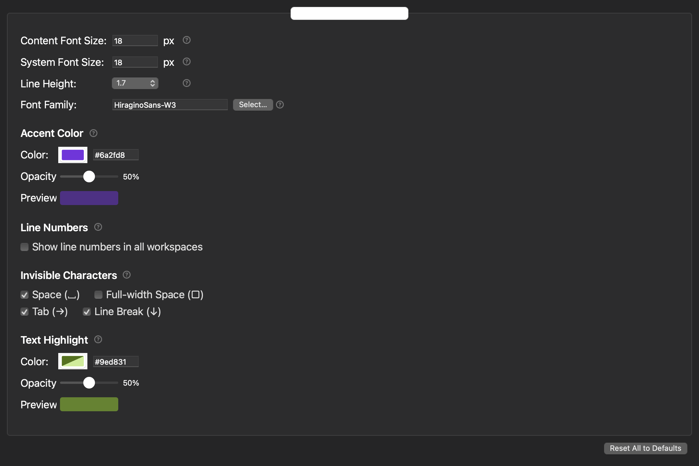
Rune Studio can adjust the editing font, text size, line height, bottom padding, line numbers, counts, editing marks, and highlights. Create the drafting view by removing cues that do not help composition. Create the proofreading view by restoring only the cues associated with errors in your log. Write the exact values in a short project note so that a later chapter or a different Mac can start from the same baseline.
The test covers the editor display only. It does not rank font licenses, recommend embedding a font in an EPUB, or choose typography for a printed book. The font used to edit a manuscript and the styling delivered to readers are different decisions. Keeping those decisions separate prevents a comfortable editor setting from becoming an unsupported publishing assumption.
Decide with repeatable evidence
A useful text-editor font setup is one you can restore for the next writing stage. Keep the selected font, passage, window width, session length, and scoring method fixed. Move one display value at a time and write the two final profiles on one card. This turns a preference into an operational routine without pretending that everyone sees text in the same way.
Start today by recording the current font and creating only a drafting profile and a proofreading profile. Run one switch-and-restore cycle, keep the results, and remove any difference that does not help its assigned task. The deliverable is two reliable views, not a longer list of typeface candidates.