A useful text-editor font setup is rarely one universal font at one universal size. Drafting, revision, and proofreading put different demands on the same screen. Drafting benefits from a calm single reading column. Revision often needs two documents side by side. Proofreading can justify larger text because the goal is to notice punctuation, spaces, and small substitutions rather than to fit the most words on screen.
The practical answer is to save a layout for each job. As a starting experiment, try 16 pt for drafting, 18 pt for a split revision view, and 20 pt for proofreading. Those numbers are test points, not accessibility claims or prescriptions. Your display, viewing distance, font choice, and eyesight should decide the final values.
Name the job before changing the font
If you begin by cycling through typefaces, it is hard to tell what improved. Write one sentence for each working mode first:
- Drafting: one manuscript, minimal side panels, uninterrupted forward writing.
- Revision: first draft and revised draft in two panes, with a source note available.
- Proofreading: corrected text beside a short issue list, with whitespace marks visible when needed.
Now the size decision has a purpose. A smaller drafting view is not automatically “better”; it is useful only if the line length remains comfortable. A larger proofing view is not automatically safer; it can become distracting if each line wraps too often.
Build the three workspaces in Rune Studio
Open Settings and use the Display section to choose the body font, body size, interface size, and line spacing. Treat those values as the workspace default. Then use the layout controls to begin with a single pane for drafting or two columns for revision. Open the manuscript, earlier draft, and note file from the file tree. A tab can be dragged into another pane when it needs a separate role.
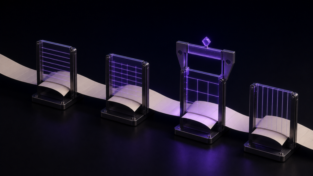
Once the arrangement makes sense, save it with a reader-facing name such as Draft, Compare, or Proof. Rune Studio can retain up to four layouts per workspace. A saved layout can include the row or column pattern, divider positions, tabs in each pane, active tab, sidebar state, preview relationship, and text-size overrides. That is what turns a font change into a repeatable working environment rather than a temporary preference.
In a hands-on check, three tabs named for manuscript, source, and quote notes were arranged across two panes. The body was set to 18 pt and the interface to 14 pt. After the workspace was closed and opened again, all three tabs returned. This verifies restoration of the saved arrangement. It does not prove that 18 pt is the most readable size for every person.
Change one visual variable at a time
Keep the manuscript, window width, and line spacing fixed while comparing 16, 18, and 20 pt. Read the same two paragraphs in each layout. During drafting, watch whether your eyes lose the next line. During revision, check whether both versions remain wide enough to understand a sentence without constant horizontal scanning. During proofreading, turn on only the whitespace marks you actually need and see whether the larger body text still leaves a useful amount of context.
Font family should be a separate pass. If size and family change together, you cannot tell whether a wider typeface or a larger point size caused the different wrapping. The same rule applies to line spacing and sidebar width.
Use reopening as the real finish line
Saving a layout is not the end of setup. Close the workspace, reopen it, and check four things: the chosen body size, the pane pattern, the files assigned to each pane, and the active tab. If one item does not return, save the corrected arrangement under a new name instead of immediately overwriting the only working layout.
This small reopening test matters because the value of layouts is not visual novelty. It is arriving the next morning with the same desk already assembled.
When a single global setting is enough
Layout-specific font settings make sense for writers who frequently compare drafts, move between drafting and proofing, or use different display densities for different tasks. If you write one file in one pane and never change modes, a single global font setting is simpler and easier to maintain.
Nor should layout settings be treated as a medical or accessibility guarantee. They can preserve a chosen configuration, but they cannot promise improved vision or identical physical sizing on every Mac. Use the saved values as reproducible preferences, then judge comfort on the display you actually use.
Start with just the revision layout: two panes, the current and previous drafts, 18 pt body text, and a clear name. Reopen it once. If that desk returns as expected, create the drafting and proofreading versions. You can review the current Mac feature set on the Rune Studio product page.