A monospaced font does not have to be the font in which you read an entire novel. It can be a temporary inspection view for number lengths, full-width and half-width characters, spaces, and repeated punctuation. Separating that job from ordinary prose reading avoids forcing one font setting to solve two different problems.
This article does not claim that one font reduces fatigue for everyone. Choosing a regular Japanese prose font through timed long-form proofreading is a separate task. Here, a monospaced candidate succeeds only when it helps you inspect alignment-sensitive material accurately and return safely to the reading setting.
Define four jobs for the monospaced view
The first job is checking digit length. Years, times, prices, episode numbers, and identifiers can contain a missing digit that the reader silently repairs from context. Collect values of the same type in a short block and look for the item that begins or ends in the wrong position.
The second job is distinguishing full-width and half-width characters. Build lines that mix Latin letters, numbers, brackets, and spaces. Do not assume that every font renders a Japanese full-width glyph at exactly twice the width of every Latin half-width glyph. Font fallback can affect the result, so observe the actual candidate with the characters used in your manuscript.
The third job is inspecting a simple table or list. Character notes and chapter progress records are sometimes aligned with spaces during editing. A monospaced view can reveal a shifted field or delimiter. It is not a promise that space-based tables will render consistently in a published EPUB; it is a temporary way to find source-editing mistakes.
The fourth job is inspecting whitespace and punctuation runs. Include full-width spaces, ordinary spaces, tabs, dashes, and ellipses in the fixture. Keep the editor’s invisible-character display in the same state for every font so it supports rather than distorts the comparison.
Build equivalent inspection fixtures
Work in copies, never the manuscript’s source of truth. Each fixture should contain four blocks:
- Numbers from one to six digits, with one deliberate length error
- Mixed full-width and half-width letters, numbers, brackets, and spaces
- Labels, delimiters, and values with one shifted field
- Several space types, tabs, dashes, and ellipses
Create an answer sheet before testing candidates. Repeatedly reading the same familiar block lets memory find an error even when the font provides no help. If you have three candidates, prepare three equivalent fixtures with the same types and counts of errors but different positions.
Rotate the candidate-to-fixture assignment. Reverse the candidate order on the following day. This reduces the advantage of later candidates after you have learned the error pattern.
Score detections, misses, and false positives
Fix the numeric font size, line spacing, window width, invisible-character state, and line-number state. Give each candidate no more than ten minutes. Record when you identify an error and which category it belongs to.
Use three measures: correct detections, missed errors, and false positives. Counting detections alone rewards a font or strategy that makes every line look suspicious. Compare the record with the answer sheet and keep the three results separate.
Do not adjust each candidate until it looks personally pleasing during the first round. A font that appears optically larger may have an unfair advantage if its size is increased while other candidates remain fixed. Narrow the field to two candidates, then adjust size and line spacing for practical use and repeat the inspection on unread blocks in reversed order.
Also record which character combination caused uncertainty. A candidate may be excellent for digit columns but poor when Japanese punctuation triggers fallback. The result can therefore be “use for numeric lists only,” not a single universal winner.
Keep reading and inspection conditions separate
A font that exposes a misplaced space quickly may still be uncomfortable for an hour of prose proofreading. Select the reading font with dialogue and narration at normal reading speed, measuring rereads and character confusion. Select the inspection font with short, structured blocks, measuring errors and false alarms.
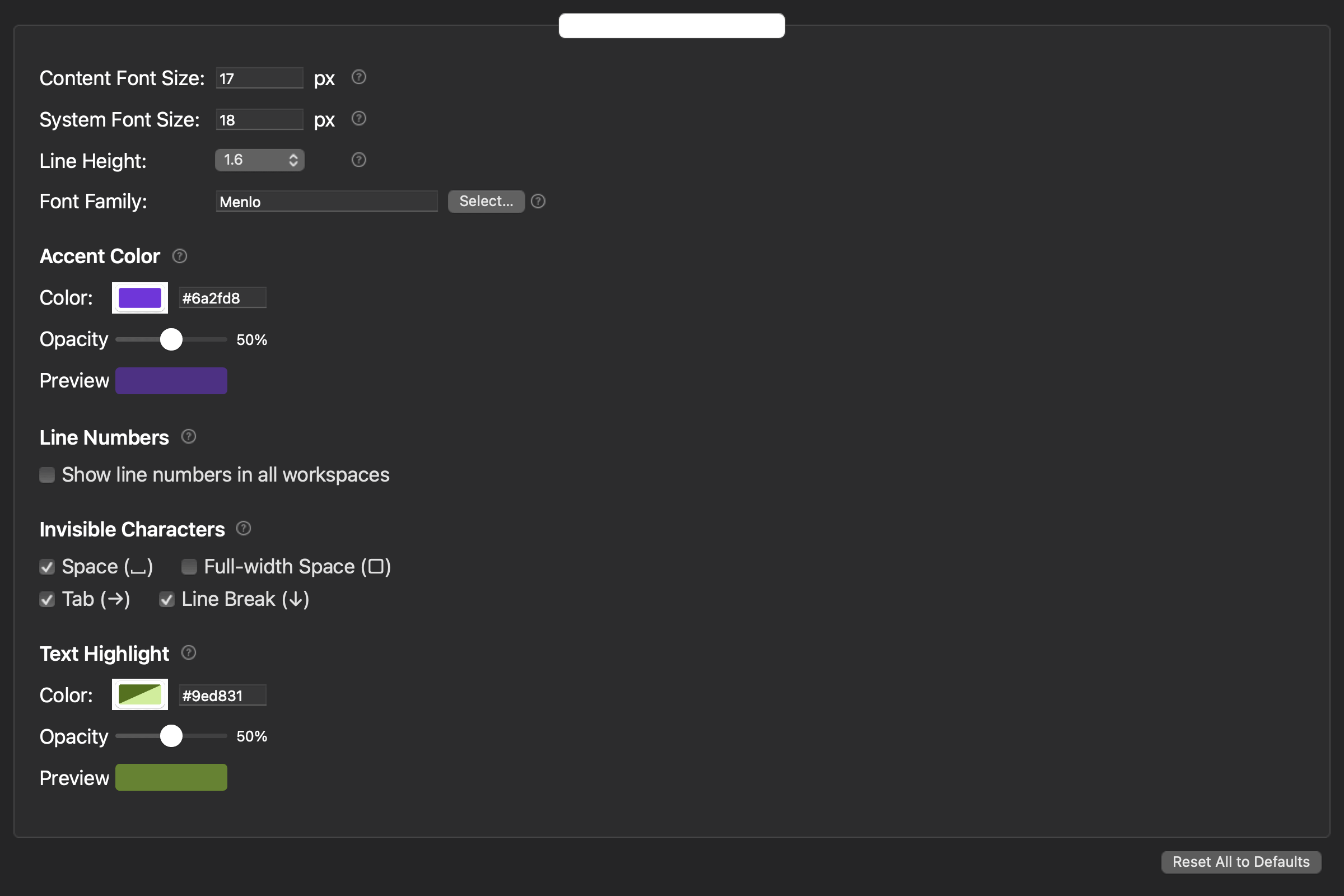
For each condition, record the purpose, font name, size, line spacing, invisible-character state, line-number state, and finish rule. Do not assume that the application automatically stores named presets unless that feature has been verified. A small written settings card is enough. After inspection, restore the reading values and open the same reference paragraph to confirm the return.
The current rune Studio feature list states that a font family can be selected through the standard macOS font panel and the editor font size can be specified numerically. Line spacing can be adjusted from 1.0 to 2.0 in 0.1 steps, and invisible characters and line numbers can be displayed. These controls make a repeatable comparison possible. They do not guarantee that a particular monospaced font is installed, that every glyph has a particular metric, or that a setting reduces medical eye fatigue.
Choose monospace as a stage-specific tool
Use a monospaced view when checking digit length, full-width and half-width forms, simple alignment, whitespace, and punctuation sequences. Rotate equivalent fixtures across candidates, count detections, misses, and false positives, and retest the top two with unread material.
Keep the long-reading font and the alignment-inspection font as two documented conditions. With a reliable return step, you can gain the diagnostic value of alignment without making the entire novel conform to a font chosen for a different job.