The best font for editing long Japanese text cannot be chosen from a one-line specimen. Rotate several equally difficult passages across the candidates and proofread for 20 minutes while keeping size and line spacing fixed. Record how often you reread a line, which similar glyphs you misread, and how many planted errors you find. Those results are more useful than appearance alone.
Font impressions are affected by size, line spacing, window width, display brightness, and assistive marks. If all of these change together, you cannot tell what improved the reading experience.
This article selects a general-purpose body font for sustained Japanese drafting and proofreading. It does not cover the specialized reasons to use a monospaced font for column alignment, fixed-width comparisons, or character-count tasks; those require a different test.
Hold non-font conditions constant
Before changing the font family, fix these conditions:
- The same Mac, display, and brightness
- The same window width and document position
- The same numeric font size and line spacing
- Passages of matched difficulty and length, with the same 20-minute duration
- The same state for invisible characters and highlights
Start with your current size and line spacing. A font may look physically larger or smaller at the same numeric size, but do not compensate immediately. First compare the shapes under equal settings. After identifying the top two candidates, adjust size and spacing in a second round.
Keep zoom level and background color constant as well. Testing one font in the morning and another after a long day can distort the result, so use similar times of day when possible.
Build several matched Japanese samples
Prepare several passages of 2,000 to 4,000 Japanese characters from normal work—enough to rotate one across each candidate. Include five elements in every passage:
- Narrative prose with long hiragana sequences
- Expository text with a high density of kanji
- Dialogue containing Japanese quotation marks and punctuation
- Lines mixing numerals, Latin letters, full-width, and half-width characters
- Deliberate typos, full-width spaces, and repeated words
A passage you have completely memorized allows context to hide weak glyph distinctions. Combine a recently written section with an older one so the trial includes both character recognition and genuine comprehension.
Keep a separate answer sheet for each passage. Match the categories and counts of planted typos, repeated words, and spaces, but change their locations. Assign passage 1 to candidate A and passage 2 to candidate B, then shift both the candidate order and passage assignment on the next day. Repeating one passage for every font would favor later candidates because the reader learns the prose and error locations.
Measure three proofreading outcomes
Switch to one candidate and read from the beginning for 20 minutes at normal proofreading speed.
Rereads
Count each time you return to the same line because the meaning did not register. Difficult prose may cause rereads in every font, so compare the pattern between candidates. Look for repeated trouble around certain character combinations rather than demanding a perfect score of zero.
Misread glyphs and punctuation
Record confusion involving detailed kanji forms, dakuten and handakuten, long-vowel marks, dashes, quotation marks, numerals, and Latin letters. For Japanese body text, a beautiful shape is less valuable when the reader must rely on context to distinguish it.
Detected errors
Count the planted typo, repeated word, and space errors that you find. Do not compare a trial with invisible-character marks or word highlights enabled against one without them. Those features can be useful, but they measure an additional aid rather than the font alone.
Adjust only the top two candidates
After ranking the candidates on the three outcomes, retain the top two. Prepare two unread chapters and retest the finalists in reversed order. Confirm that the result does not flip solely with order before changing size and line spacing. If the page feels crowded, increase line spacing in small steps. If lines are difficult to track, find a balance that creates separation without reducing the visible context too far.
Add one subjective note: after 20 minutes, could you comfortably continue? Treat this only as a within-person comparison, not as a medical claim about eye strain or fatigue.
Retest the finalists on another chapter. A body font that performs reliably in both dialogue and dense explanation is generally safer than one that excels on only a single specimen.
Controls available in rune Studio
The current Mac version of rune Studio lets you choose a font family through the standard macOS font panel and enter a numeric editor font size. Line spacing can be adjusted from 1.0 to 2.0 in increments of 0.1.
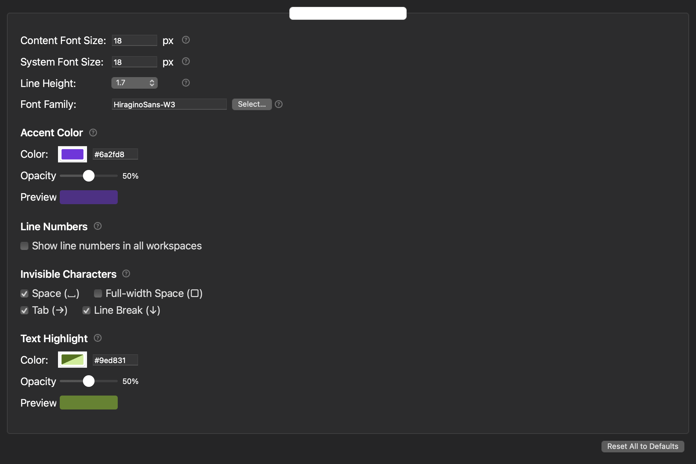
The editor also provides invisible-character marks, line numbers, and registered-word highlighting. These are separate proofreading aids. Keep their state identical across candidates, and use the reset control if you need to rebuild a consistent baseline.
Available families depend on the fonts installed on the Mac and on each font’s license. An editor display choice also does not guarantee that an EPUB reader will show the same typeface.
Choose from proofreading results, not a specimen
The best text editor font for Japanese long-form work is the one that lets you proceed with fewer rereads, distinguish similar glyphs, and detect errors under consistent conditions.
Rotate matched passages in 20-minute trials, record the three outcomes, and retest the top two on unread chapters in reversed order before adjusting size and line spacing. Choose a stable general body font first. Treat monospace as a separate task-specific display mode so its alignment benefits do not become confused with sustained reading comfort.